LyteLove - DEMO
The before times
We're on week 2 of Otome Jam and I'm currently being haunted by thoughts of the ,, very early menu designs i had for this game before it had any real solid ideas. So I'm here to share EVERY single rough gross design of this menu with you and just how much it's changed.
Please note: none of these designs were used in Otome Jam and everything I made for the game, was made new (aside from vague plot and character ideas) during the game jam time frame!
also these were,, some of my very first attempts at 'graphic design' for visual novels! before i was just solely recoloring the default renpy assets.
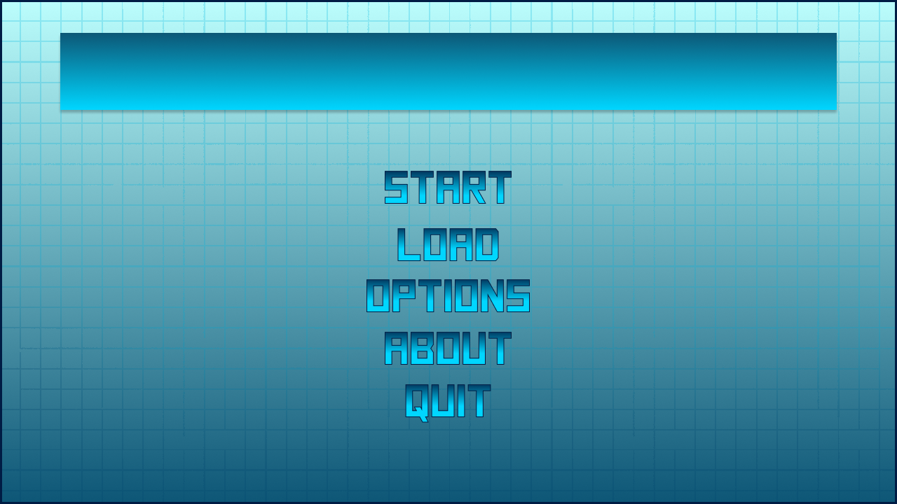
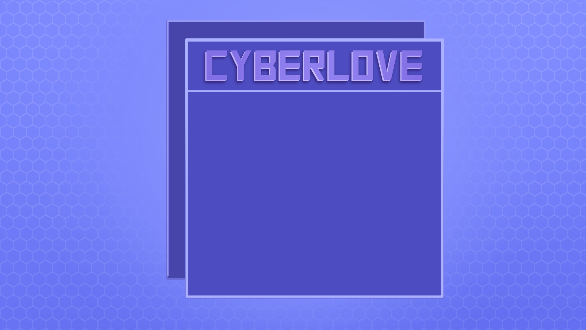
these two were the very verrryy first drafts i had when i started thinking about this game. I leaned a little too heavily into the uhh, 'Cyber' aspect and they weren't the right vibe.
Also why blue? and why all the dang gradients
ANyways, from there I started looking at more game menus n stuff and watched a few tutorials on image buttons (This was a life saver)
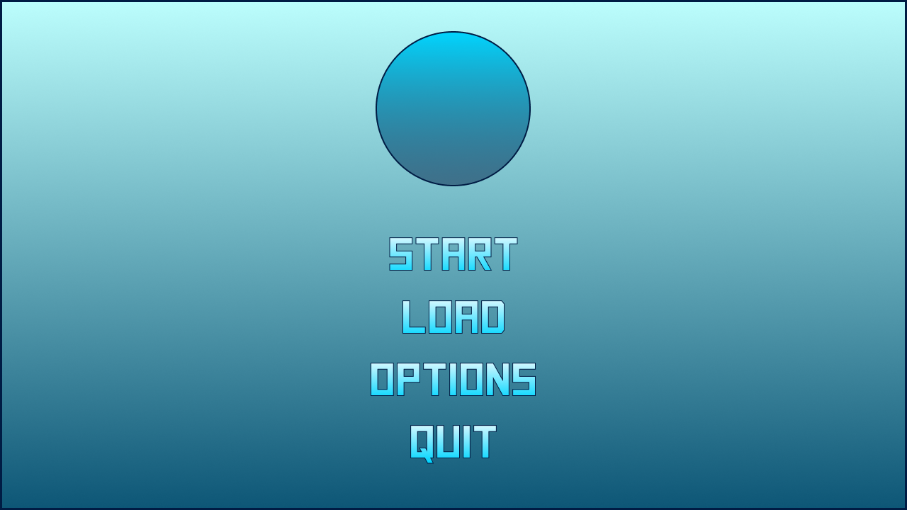
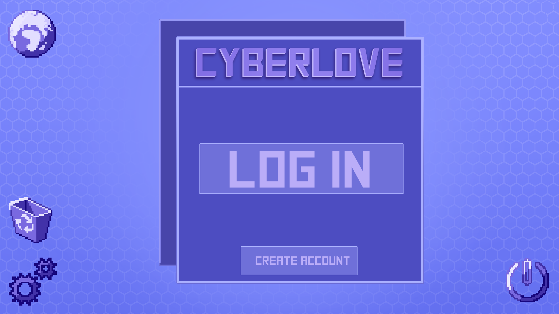
this was one of the earliest concepts, and it was a bit rough if I'm being honest.
The vibes of it being online were a lot more there, but the colors were a bit off and the lines a bit stark. ALSO AGAIN WITH THE GRADIENTS MAX WHAT. (Side note, I made my poor fiance make the icons for these)
The premise to the ones above are similar to what I have now. Power - quit, gears - settings, globe - link to my itch
from there things started getting a bit better when i realized purple was a bit better on the eyes and we had,, a lot less gradients. (most of this is the same, just recolored and on a different background. From here I admittedly kinda gave up for a little bit (like several months) because I wasn't happy with how things looked. I actually ended up working on Twynflower for a shorter game jam with a random group during this time, and it kicked my brain back into gear.
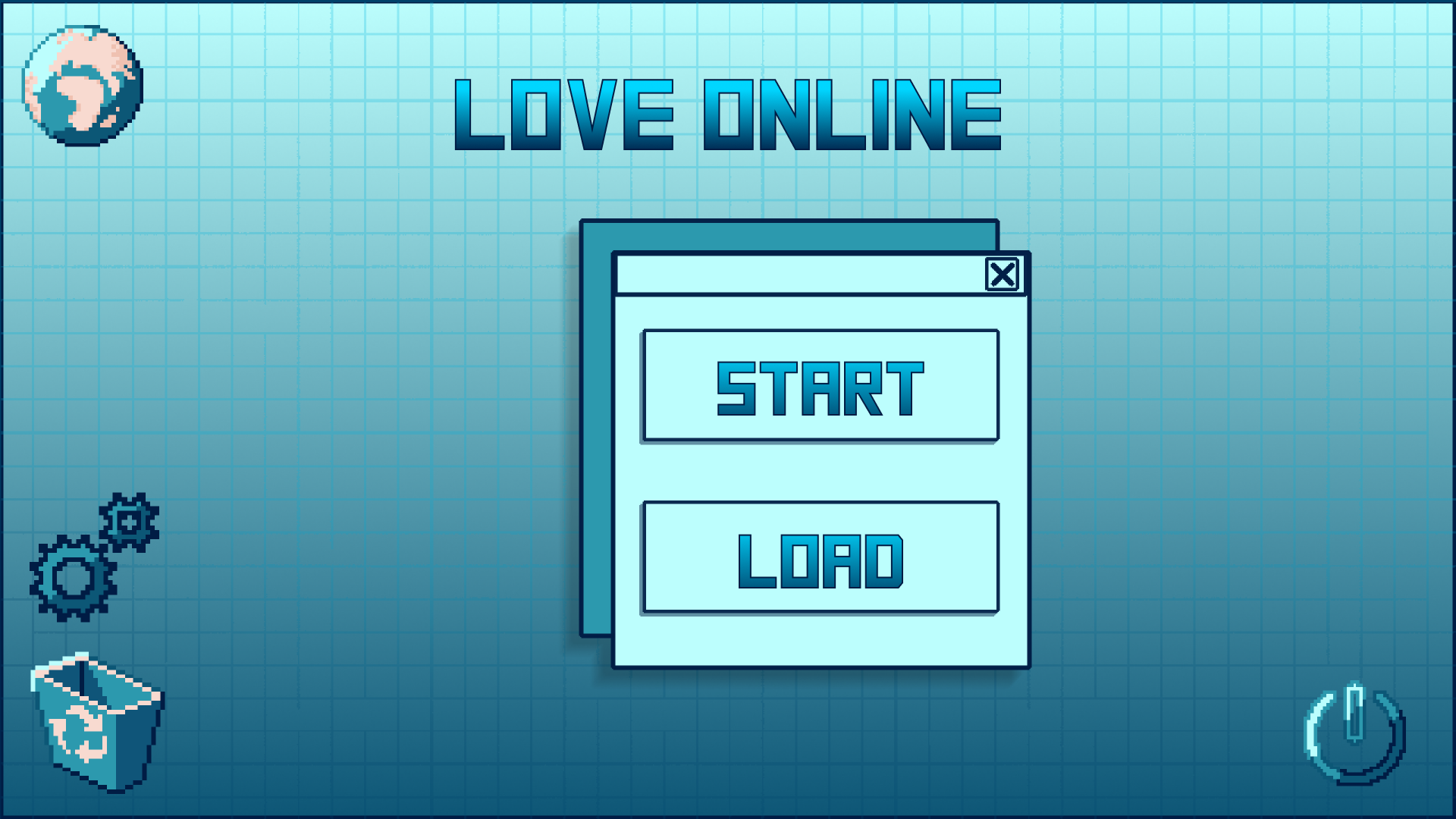
(Side bar: Notice the name change? I hated BOTH of these equally, but nothing else felt right)
So when I saw otome jame, i decided i wanted to get more Specific with it. So I set out to redesign that menu screen with the old design in mind (The purple old one) but also looking at some of my favorite visual novels for color palette inspo. Some of these included (You guessed it) Blooming Panic and Error143. BUT it was also heavily influenced in some areas by Butterfly soup! As well as a handful of other 'online' based dating sim visual novels, like online at the perfect time, emily is away, etc. You name it, i've probably consumed it.
anyways, this is where we landed with the start menu
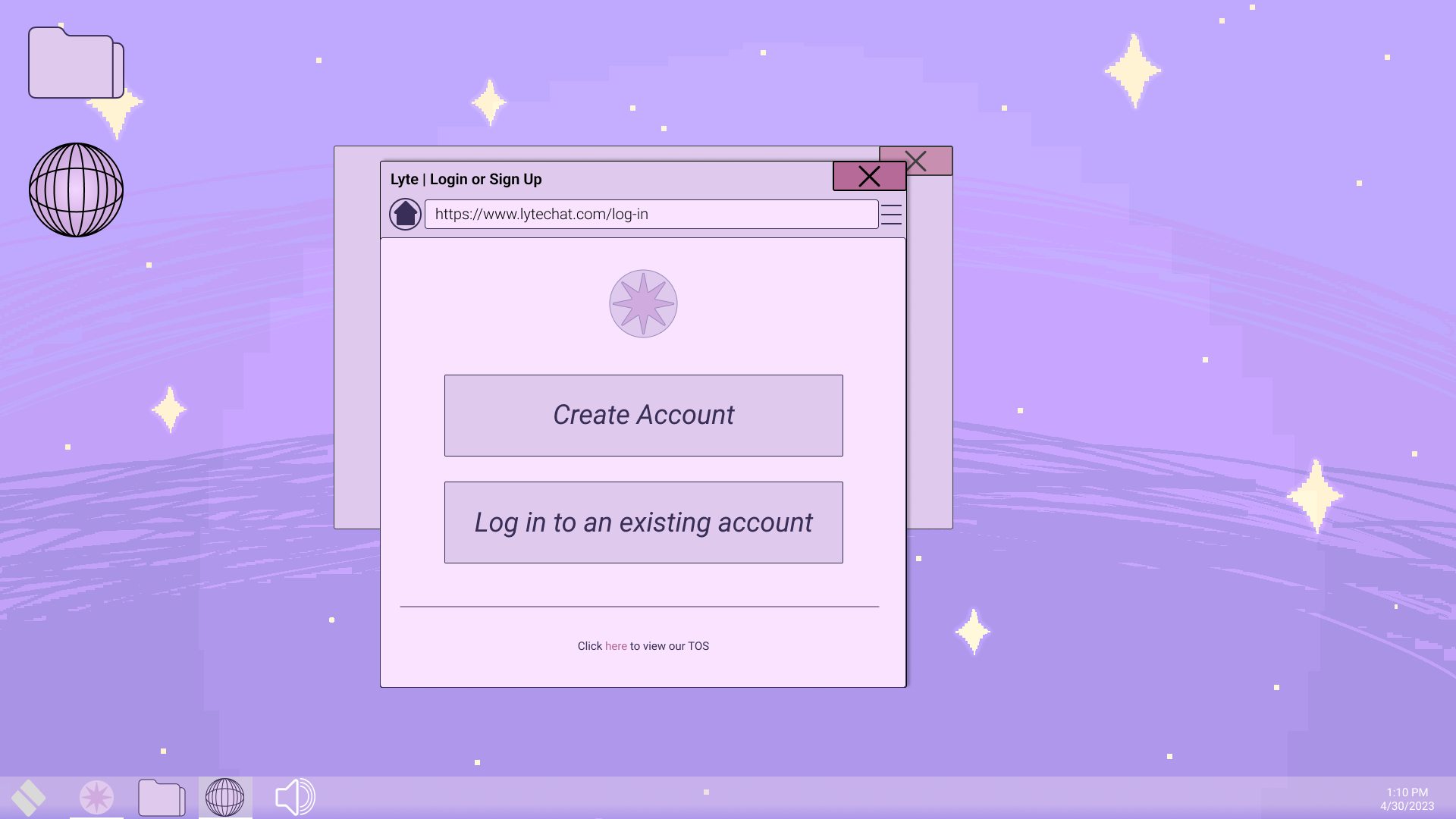
not too bad right? I will admit as of this point I still feel like some thing are a bit flat and could be fixed with some more contrast in certain areas to mimic a screen more but.
I wanna talk about the inspo for this.
So Lyte. Not discord actually, though the premis is there somewhat. I actually tried to mimic skype a bit where I could with certain aspects ( Not completeley since we aren't adding in a video call feature (yet 👀)
I originally wanted the main menu and game menus, and all that, to mimic windows 8, but it ended up leaning more to windows 10. Both of these OS were used during the rough time frame I wanted to reference with the game (think mid 2010s). I spent,,, a LOT of time staring at my task bar trying to get sizing right to an extent, and ofc its not spot on. I hate small icons and text in games because I like seeing things.
About the buttons though...
Create account - Start a new game
Log in - load game
Folder Icon - CG Gallery
Globe - link to my itch!
"windows" icon in the bottom left - Quit
Volume Icon in the task bar - Preferences!
Now let's look at the in game pause menu design
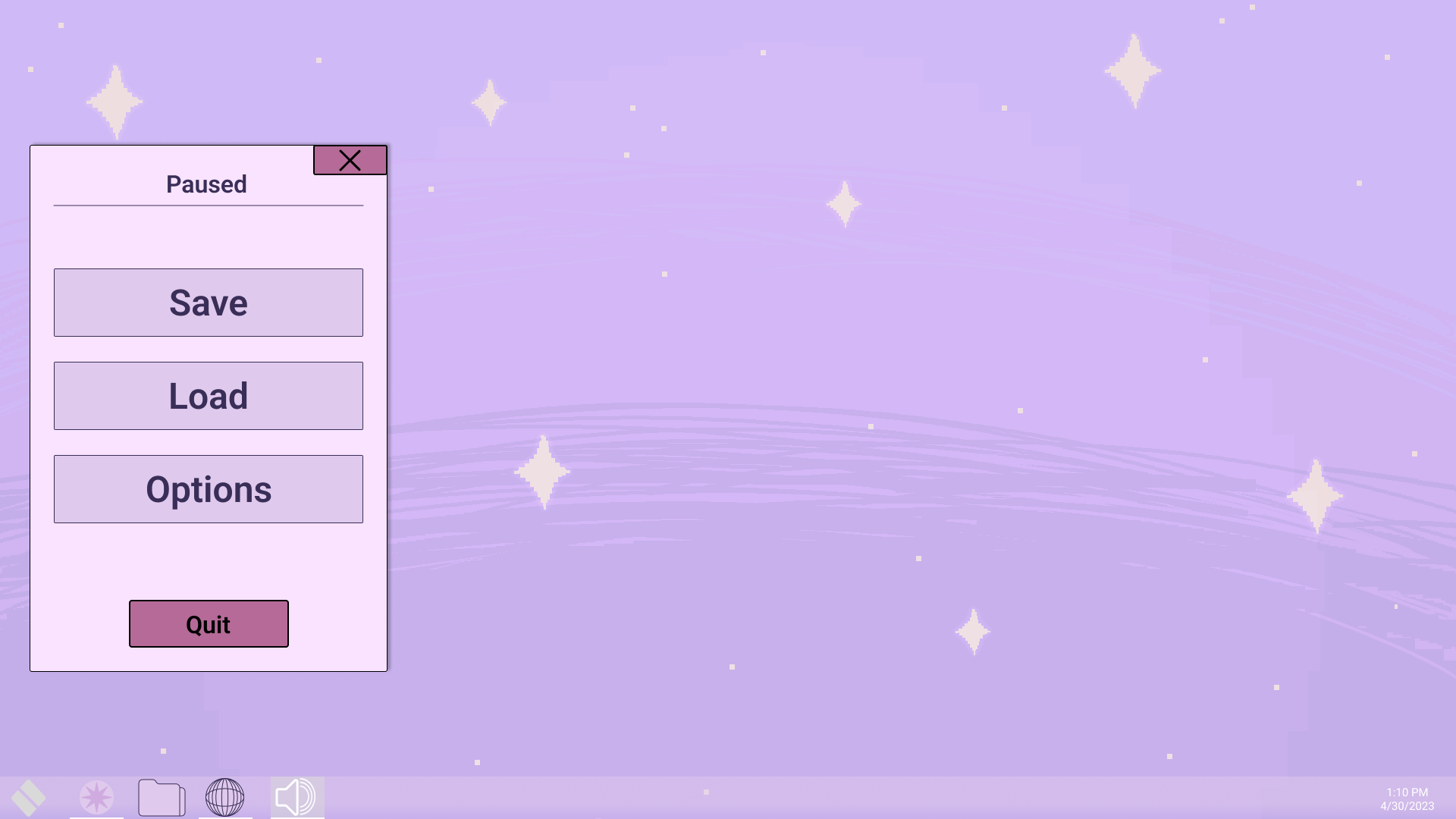
SImilar vibe, but the buttons are more self explanatory here. This menu is shown in both the save/load menu AND the preferences.
and for a last lil sneaky peak snippet,, the disaster of frames n junk on my figma document for some of the screens
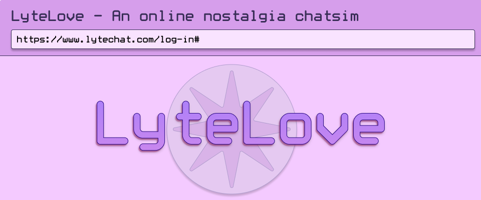
As of now, and hopefully permanently. The name is LyteLove. Thank u to Soup (artist!) for helping settle on this one. We ended up loving it because it felt less harsh/technical/cyber than the other names and I thought it was a cute touch since it starts off with growing up with these characters as teens and is a 'lyte' version of love! No hot and heavy romance here (maybe a lil trauma tho)
Leave a comment
Log in with itch.io to leave a comment.